Watch the full tutorial
What the Colour Harmonizer Is — and Isn’t
The Colour Harmonizer is a new module in Darktable 5.6, born from a discussion on the Pixls.us forum. Before anything else, it’s worth being clear about what it does — because it’s easy to confuse with Colour Balance RGB.
Colour Balance RGB adds hue and tint to specific tonal zones — you’re pushing shadows cooler, highlights warmer, and so on. You’re adding colour.
Colour Harmonizer works on the hues already present in your image and tries to pull them toward a chosen harmonic relationship. You’re reorganising existing colour, not adding new colour.
It’s a subtle finishing tool, not a colour grading tool. Use it at the end of your edit, not the beginning.
How to Use It
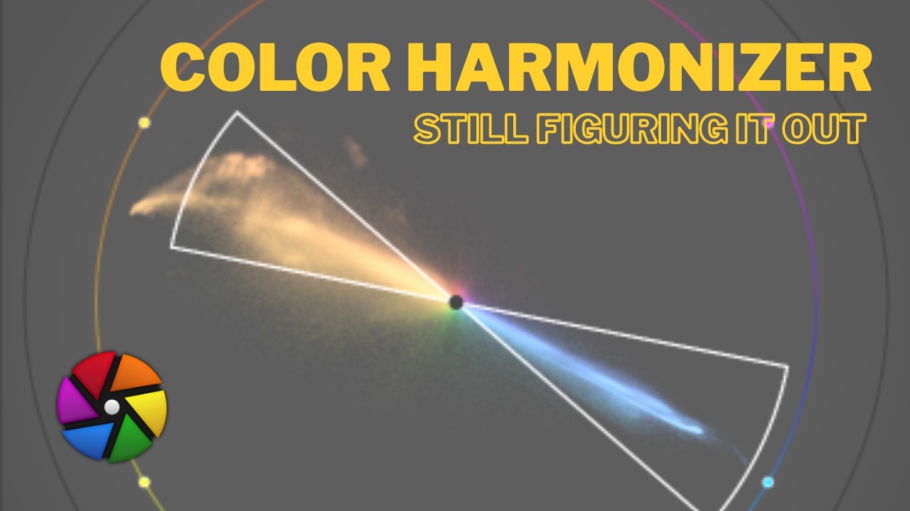
Open the vectorscope first — the Colour Harmonizer is designed to be used while watching the vectorscope so you can see how your hues are being pulled.
Step 1: Choose a Harmony Rule
This defines the harmonic structure you want to impose on your image — how many colour nodes exist and where they sit on the colour wheel:
- Complementary — two opposite hues; adds contrast and vibrancy
- Triad — three evenly spaced hues; more colourful, more complex
- Other presets available depending on your image
Step 2: Set the Hue Anchor
This is the most important control. The hue anchor rotates the harmony around the colour wheel to find where it best fits your image. Use the automatic camera button to let Darktable suggest the closest existing harmony in your image — a good starting point before manual adjustment.
Step 3: Adjust Pull Strength and Width
Pull Strength — how aggressively colours are pulled toward the harmony nodes. 0 is no effect, 1 is maximum. Stay well below 1 for natural results.
Pull Width — how far from each node the harmonizer reaches to pull colours in. Higher values affect a broader range of hues.
Step 4: Neutral Protection
This is critical. If your image has neutral grey areas — white walls, grey skies, concrete — the harmonizer can accidentally shift their hue. The neutral protection slider preserves those areas. Use it whenever your image contains whites or greys you want to keep neutral.
Smoothing and Saturation
Keep Smoothing at or near zero unless you see visible artefacts — internal transitions are already handled gracefully. The Saturation sliders per node allow minor emphasis adjustments but this is not the right module for saturation work — do that in a dedicated module.
The Custom Mode
Beyond the preset harmony rules, a Custom mode lets you position nodes freely on the colour wheel without following a preset pattern. This is useful for:
- Emphasising one specific hue without touching others
- Adjusting one colour in a series of images for consistency
- Deliberately breaking harmony to create tension between two colours
Used carefully it gives you precise hue nudging. Used aggressively it quickly looks unnatural.
What It Works Best On
The Colour Harmonizer works best on images that are already close to harmonic — it fine-tunes rather than transforms. Trying to impose a complementary harmony on an image with chaotic, clashing colours will not produce a good result. It will feel forced.
It also has no subject detection — it works purely on hue values across the whole image. If your subject’s skin tone or an important colour shifts in an unwanted way, mask that area first (the AI masking tool works well here) before applying the harmonizer.
Where It Sits in the Workflow
Use the Colour Harmonizer as a last step — after exposure, white balance, tone mapping, Colour Balance RGB, and any local adjustments. It’s a final polish, not a foundation.
Background
The module was initiated by the Pixls.us community and coded with AI assistance, then reviewed and revised by Darktable’s human developers before being included in 5.6. There is no AI functionality in the module itself — the AI was used in the development process, not the processing.