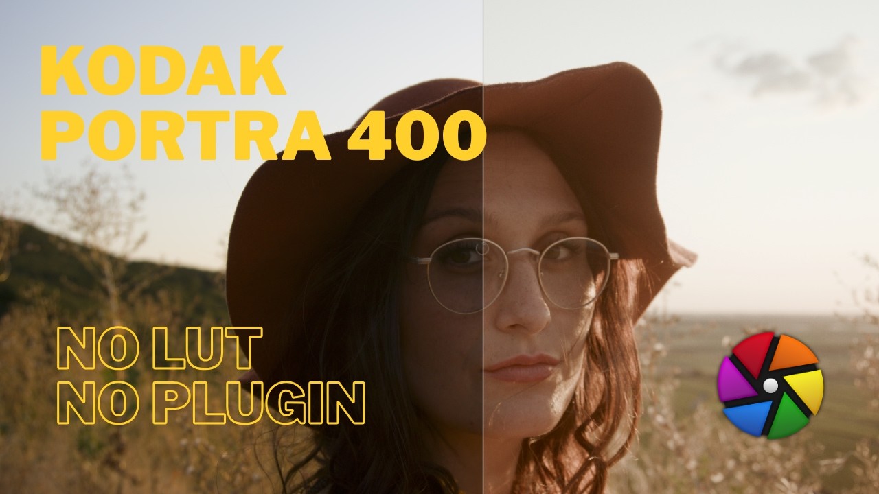
Watch the full tutorial
What Defines the Portra 400 Look?
Kodak Portra 400 is one of the most beloved film stocks in portrait photography — warm, flattering skin tones, restrained but not flat saturation, and a characteristic soft highlight rolloff that never feels harsh. Three things to nail:
- Soft highlight rolloff — highlights fade gently rather than clipping
- Restrained saturation — warm but not vivid; no blown-out reds or greens
- Warm shadows — shadows stay on the orange/amber side, not cool
This tutorial uses only AgX and Colour Balance RGB — no LUT, no plugin, nothing to install. The practice image is a freely downloadable RAW file from Pixls.us — credit to the original photographer in the video description. Download it and follow along.
Step 1: Exposure and White Balance
Start with the fundamentals before touching anything creative.
Exposure: Expose for the skin. For a portrait, skin tones should sit in the correct midtone range — bump exposure until the skin reads correctly, even if the sky blows out slightly. AgX will handle the highlights in the next step.
White balance: Use Colour Calibration (not the legacy White Balance module). For this sunset portrait, keep the white balance relatively neutral — daylight preset works well. Resist the urge to warm it up here. The warmth will come from Colour Balance RGB, where you have much more precise control over which tones get warm and which don’t.
Step 2: AgX — Soft Highlight Rolloff
Apply AgX to handle the highlights and set the tonal foundation:
- Click Auto-tune Levels
- Apply the Blender Light Base preset
The key result: highlights that were clipping without AgX — sky detail, bright areas — are now recovered and roll off gently rather than cutting hard to white. This gentle compression is the foundation of the film look. Don’t push AgX further than needed here — the creative work happens in Colour Balance RGB.
Step 3: Colour Balance RGB — Building the Portra Look
This is where the Portra 400 character is built. Work through the module in this order:
Master Tab — Global Desaturation
Pull the global Saturation down significantly — around -36%. Portra 400 is warm but restrained; this desaturation is the foundation that prevents the look from feeling oversaturated or digital.
Four Ways Tab — Global Offset
Shift the global hue warm without adding intensity:
- Hue: ~35 (toward orange/amber)
- Chroma: ~0.15 (keep it subtle — this affects the whole image)
Toggle on and off to check — you’re looking for a gentle warmth across the image, not a dramatic colour cast.
Shadows — Keep Them Warm
Portra 400 shadows stay warm, not cool:
- Hue: ~30 (orange side)
- Chroma: ~6
The numbers are higher than the global offset because this only affects the shadow zone — you can push further without affecting the whole image. Check under hats, in hair, and in dark areas of the frame.
Midtones (Power) — Skin Colour
- Hue: ~40 (slightly more yellow than the shadows)
- Chroma: ~1
Keep the chroma very low here — midtones affect skin directly and even a small push has a visible effect. At 1% you’re adding warmth; at 5% it becomes too much. The goal is natural, not painted.
Highlights — Cream, Not White
- Hue: ~50 (yellow/cream)
- Chroma: ~3
This turns blown-looking white highlights into the warm cream tones characteristic of Portra. Check the sky, the bright side of the face, any specular areas. Toggle on and off to verify you’re adding warmth without pushing it too far.
Optional: Film Grain
Add grain via the Grain module at roughly ISO 400 equivalent if posting to social media — it reinforces the film aesthetic. Skip it for print, where the printing process already introduces its own texture and additional grain rarely helps.
The Full Workflow
| Step | Module | Purpose |
|---|---|---|
| 1 | Exposure | Expose for skin |
| 2 | Colour Calibration | Neutral white balance |
| 3 | AgX (Blender Light Base) | Soft highlight rolloff |
| 4 | Colour Balance RGB — Master | Global desaturation (-36%) |
| 5 | Colour Balance RGB — Four Ways Global | Gentle overall warmth |
| 6 | Colour Balance RGB — Shadows | Warm shadows |
| 7 | Colour Balance RGB — Midtones | Skin warmth |
| 8 | Colour Balance RGB — Highlights | Cream highlights |
| 9 | Grain (optional) | Film texture |
A Note on Presets
The slider values here are a starting point, not a universal recipe. Every image is different — a golden hour portrait needs less warmth than a studio shot under cool lighting. Use these numbers to understand the direction each slider pushes, then find your own balance. That understanding is more valuable than any preset.